Signature Theatre Season Show Art

Art Design
Project Overview
Signature Theatre creates art graphics for the musicals and plays of their year-long seasons. A large part of what sells any show is the graphics, as it provides insight into what the show is about and its tone at a glance. The process involved collaborating with and presenting to senior staff, including the artistic and managing directors as well as marketing directors, to find the right imagery and messaging.

Tasks included reading through each script, researching themes and relevant context, creating multiple quick mock-ups per show to then narrow down and refine, assisting with the direction of the photo shoots, and creating the final graphics with photo manipulation through Photoshop. Below is the process for each show.
Scope: 4 months, January – April 2025
Project Roles: Research, concept, design, photo manipulation, and typography
Tools: Miro, Photoshop, Illustrator
Show 1: Play On!
"Aspiring songwriter Vy comes to swinging 1930s Harlem to make it big. But when she discovers the doors of opportunity are closed to women, she disguises herself as a man to pitch her songs to Harlem’s hottest composer, the Duke. However, when her tunes attract the attention of Cotton Club performer Lady Liv, the object of the Duke’s affection, Vy-Man is swept up in a swinging tempest of love, mistaken identity and jazz." —SIGNATURE THEATRE

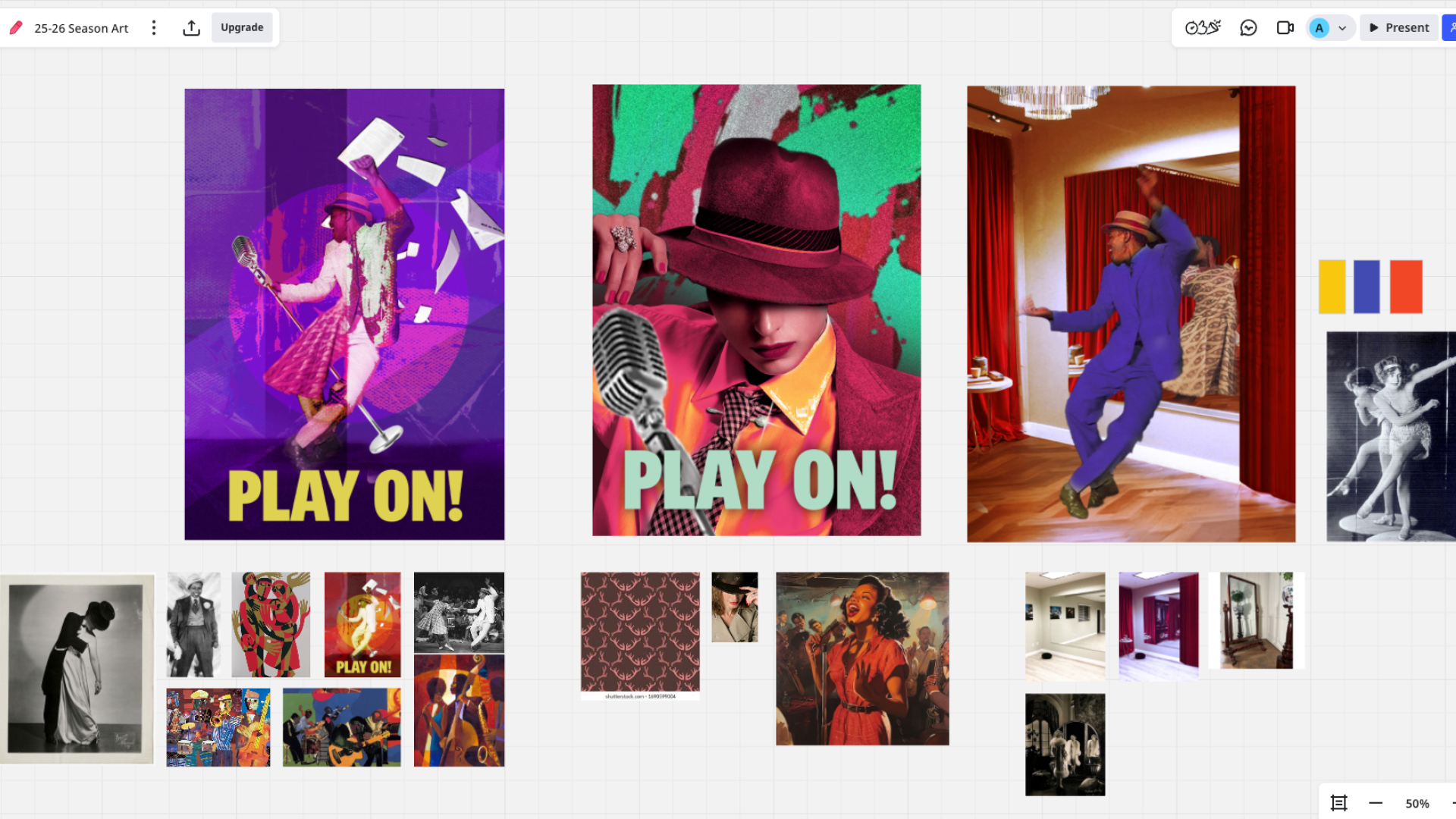
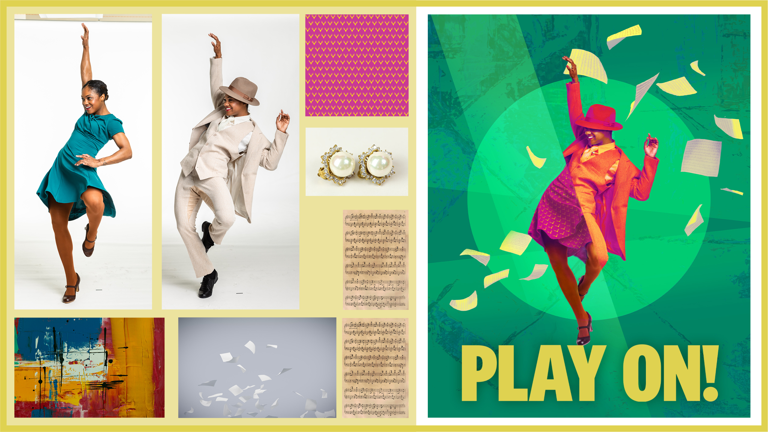
For Play On, we wanted to be able to depict the liveliness of the show within the context of the Harlem renaissance. The challenge was that the depiction should include the drag within the story in a unique way, as well as references to Shakespeare's Twelfth Night of which the show is based on. The final graphic resulted in a carefully stitched-together image of a dancer (Vy) in both drag and dressed as a woman with a spotlight as a transition, and the details in the clothing calling to themes in Twelfth Night.

For the photoshoot, the objective was that the model had to wear two separate outfits yet strike the same dynamic dance pose so that it would make sense when stitched together. As I helped direct the photoshoot along with our internal team, I gave pose suggestions with my concept in mind to make sure there was still movement in the outfits (flowing of the dress and blazer) so it worked when I edited in Photoshop. The final selects were as similar as physically possible, but not completely one-to-one, so I edited the limbs and fabric to better match the pose. To create balance in the image so that it didn't feel too vertical, I added sheet music being thrown to make the composition more square.
Show 2: Strategic Love Play
"From Succession writer Miriam Battye comes a razor sharp, not-quite-romantic comedy about the absurdity of modern dating in the seemingly endless quest to find “the one.” After matching online, a man and a woman meet for a date. Although they start off on the (very) wrong foot, they slowly begin to let down their guard in the hope that this time they’ve found something real." —SIGNATURE THEATRE

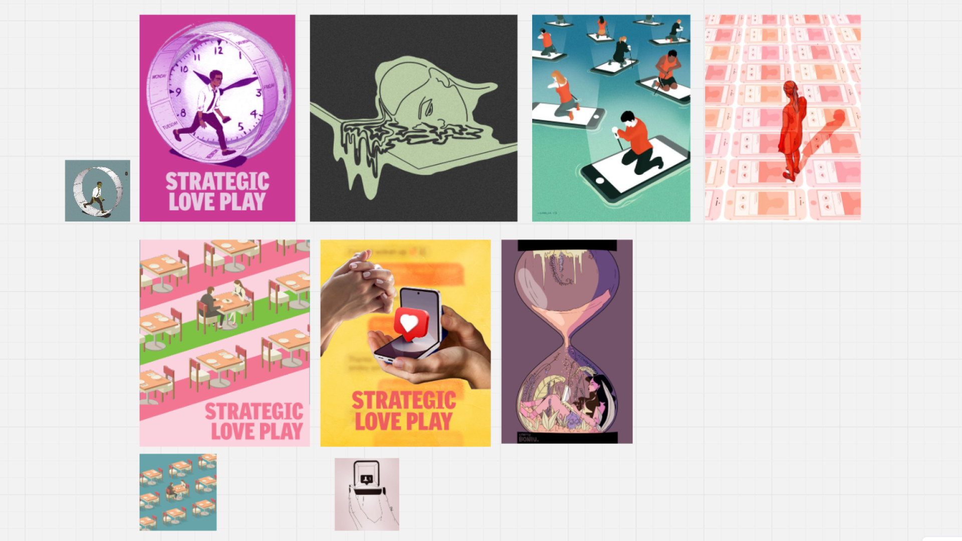
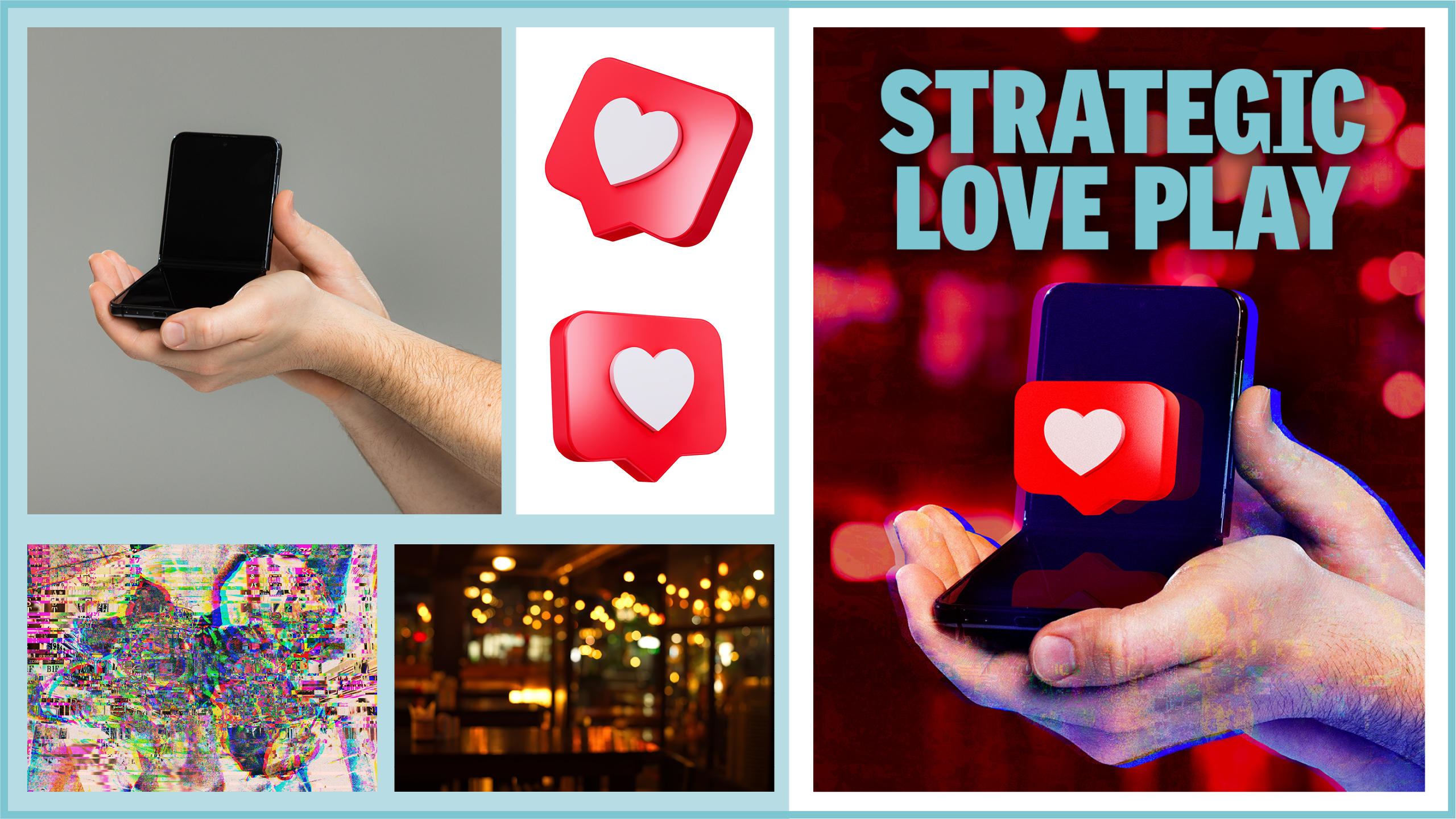
The graphic of this play was more of a conceptual challenge: how do we depict the current state of dating (online dating apps) in imagery that is almost miserable and bleak, but still humorous and easy to understand at a glance without revealing the faces of the cast (who have not auditioned at this point)? The characters essentially fly through dating, marriage, and divorce over the course of their first and only date. With that in mind, the final concept I envisioned resembles a marriage proposal, but in place of the ring box is a Z Flip phone with a like notification as the "ring."

This twist on proposal imagery is a call to how dating has transitioned to being a largely online experience, especially for meeting new people. You have access to hundreds profiles at your fingertips—so many profiles to the point of being overwhelming. If you manage to match with someone you can either make the effort of conversing and meeting, or with a few annoyances or differences you could easily unmatch with a single swipe. Why waste time getting to know that person more when you could keep swiping to find "the one"? The premise of this play is that the two characters are trying to end the demoralizing search of the apps, get past the awkward dance of dating, and find their "person."
Show 3: Fiddler on the Roof
"Tevye, a poor Jewish milkman, his family and their tightknit community honor tradition but must contend with a changing world and a rise in anti-Semitism at their home in Czarist Russia. The glorious score... unite[s] with exquisite dance in this classic of the musical theater canon filled with humor, heart—and life." —SIGNATURE THEATRE

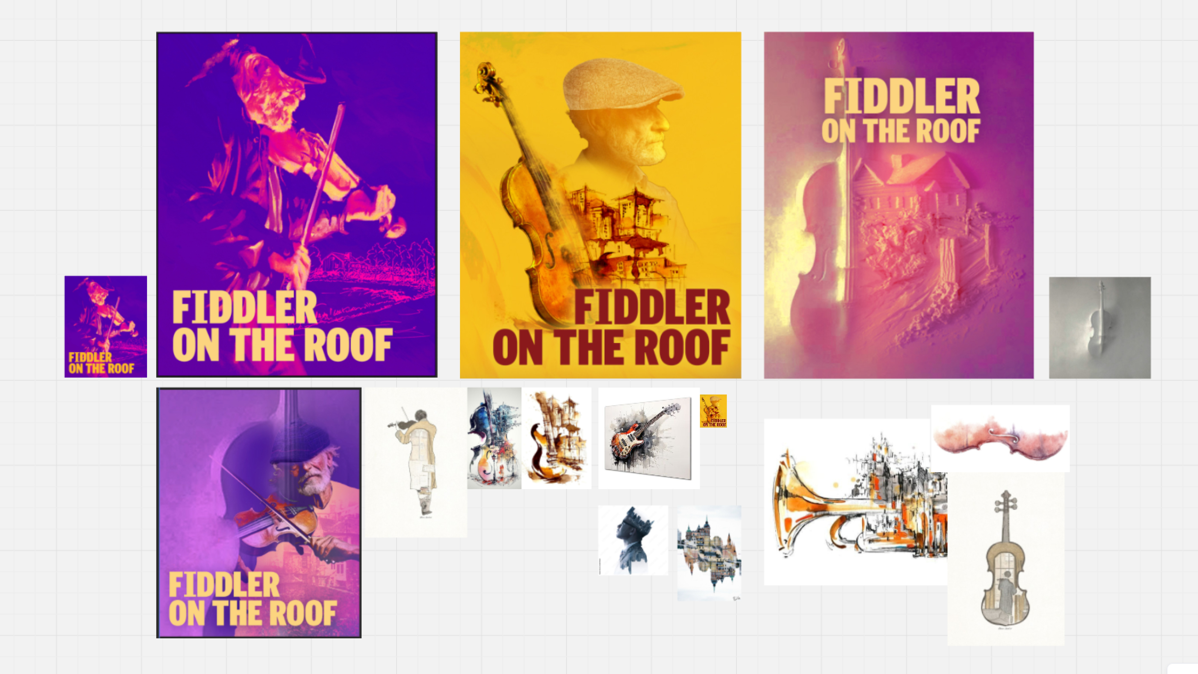
Fiddler on the Roof
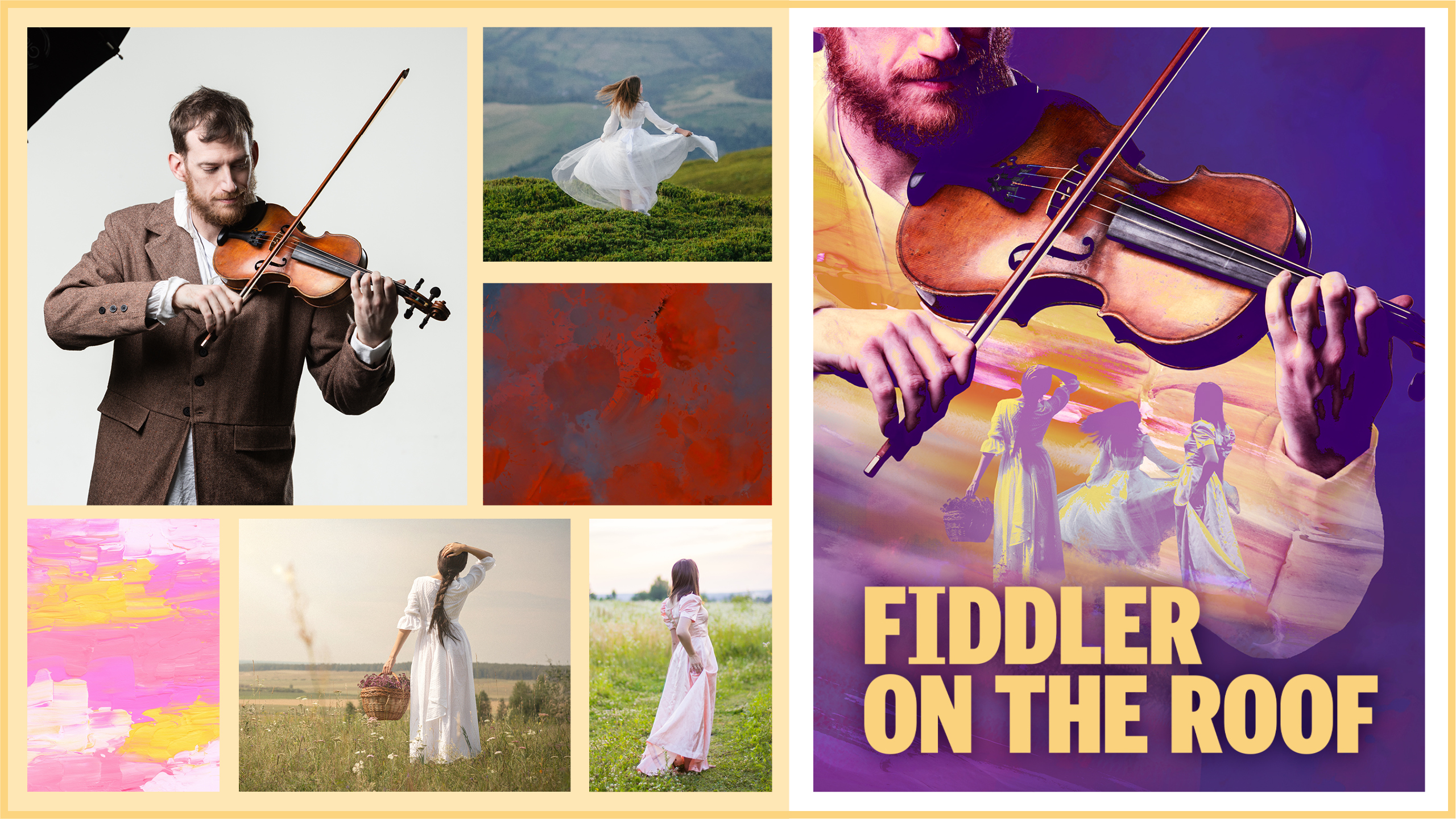
is a well-known musical depicting how tradition impacts Jewish life, with Tevye (the father) and his three eldest daughters as the main characters. The challenge for this artwork was to create a unique work that still includes the fiddler of the musical in some way, with soft and darker coloring to reflect the tone of the story. The result is imagery of the three daughters enveloped in the silhouette of the fiddler, a major symbol of the themes of the show.

This artwork was another conceptual challenge, as the fiddler itself is a concept, not an actual character of the show. The fiddler on the roof is a representation of trying to survive as best as you can without taking a wrong step and "falling." One could take the easy route and just not fiddle on the roof (in this case, leave Russia or convert from their faith), but that would mean abandoning everything they stand for and their way of life. This also applies to Tevye parenting his daughters: does he stick to tradition and the way of life he had grown up in, refusing their requests, or does he let them be free to go where their hearts take them?
Show 4: In Clay
"On the eve of a visit from her estranged childhood friend, now an acclaimed painter, French ceramist Marie-Berthe Cazin recounts her life. From her early days as a gifted protégée discovering the art of pottery, to watching her husband rise to fame partly by claiming her work as his own, through the upheaval of World War I, Marie’s unwavering spirit reveals the beauty in the broken." —SIGNATURE THEATRE

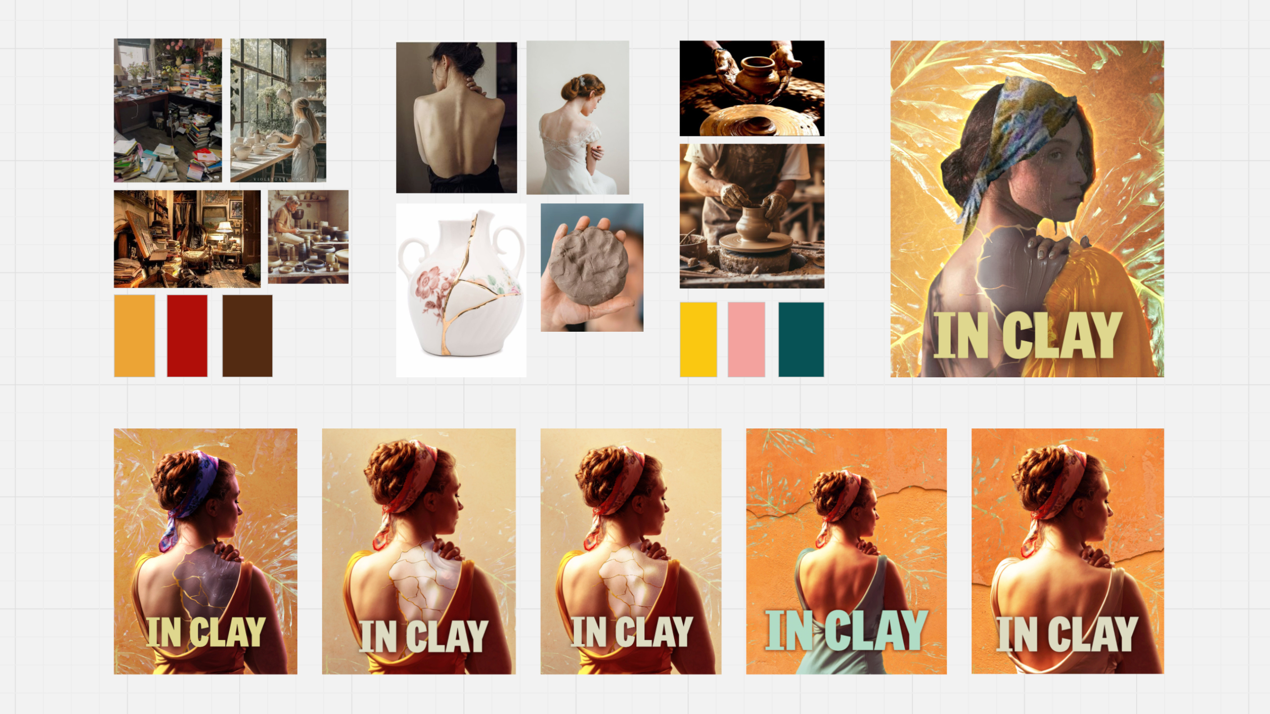
An important scene depicts Marie fixing her very first work of pottery, that she had destroyed by mistake, with the Japanese technique of Kinstugi. The initially approved concept was of a woman (Marie) with her exposed back in view and partially made of cracked clay, the gold "kinstugi" holding together the pieces as she sculpts part of her shoulder. This was meant to represent Marie creating her own worth and carving out her own purpose.

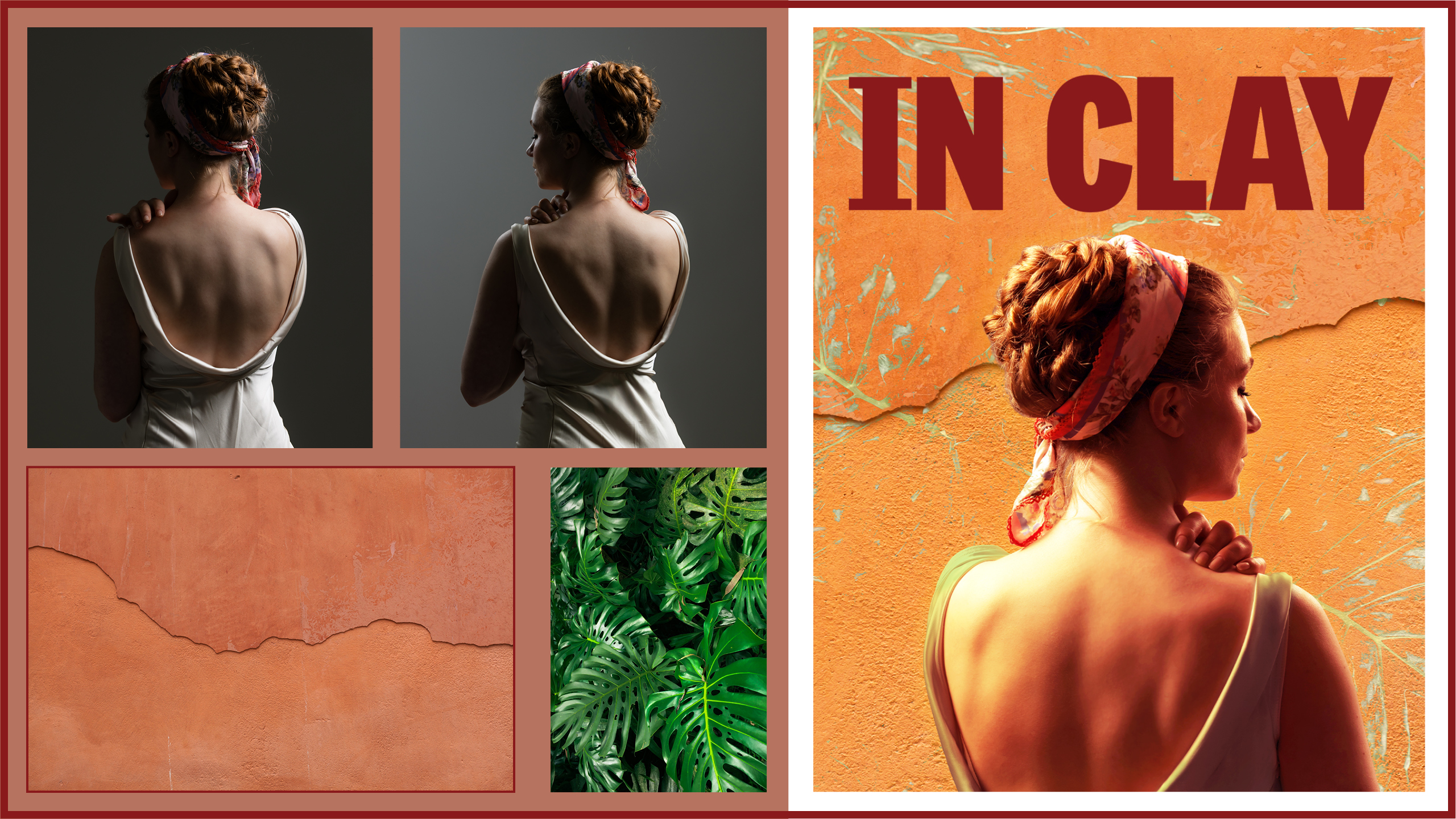
However, after seeing a more completed graphic, the team felt it could be interpreted as Marie in pain with this specific pose and treatment. We could not go back to reshoot with our time constraints, so we had to make use of the photos we had. With that in mind, we decided to remove the clay part of her back, and I further edited the graphic to make her look more pensive, with the crack of the clay background running behind her head. The final graphic is a vibrant, earth-toned image representing Marie's mental journey to contentment.
Show 5: Safety Not Guaranteed
"An imaginative indie-rock musical by Guster’s Ryan Miller and Nick Blaemire (Soon, Glory Days) based on the film of the same name... After seeing this classified ad, ambitious journalist Darius sets out on an expedition to find its writer. When she agrees to go along for the ride, however, Darius finds herself in way over her head. Heartwarming and hilarious, with an electrifying score, Safety Not Guaranteed asks, if you could go back and change your story—would you?" —SIGNATURE THEATRE

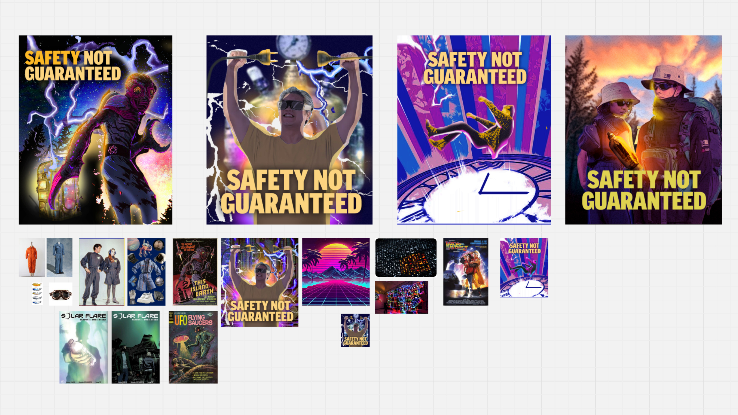
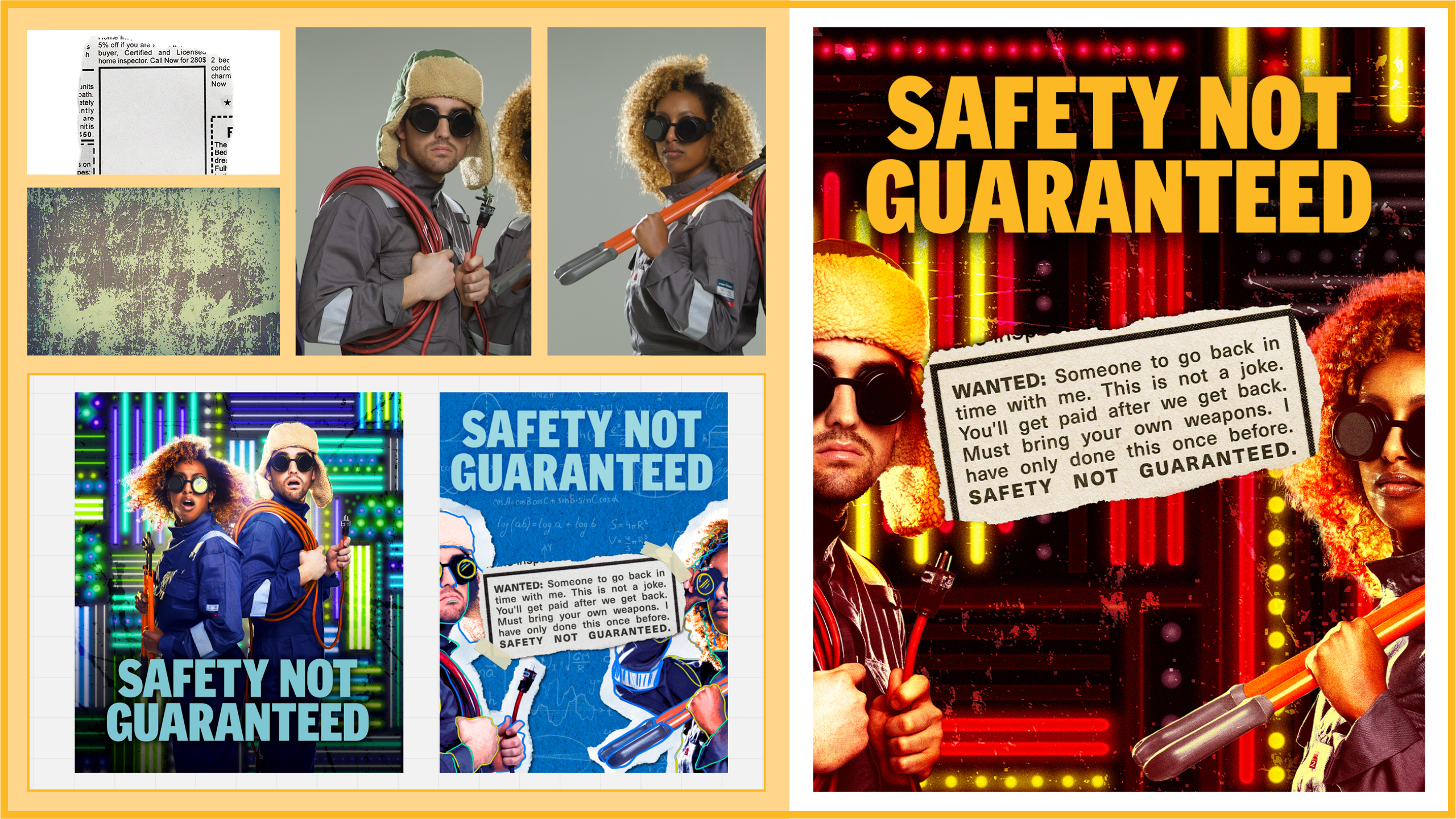
The most challenging show to design for was Safety Not Guaranteed. The Artistic Director had a strong vision for this graphic, so based on his guidance and the references he provided I created the first graphic for approval. We wanted to capture the adventuring and sci-fi aspects of the show which resulted in a bright graphic of the two main characters caught in their scheme, the light wall behind them highlighting the outlines of their silhouettes. While the internal team loved it, we had a major donor funding the show who felt the graphic needed to be more "handmade" and match the buddy comedy adventure of the story. Based on that feedback we quickly pivoted to a construction paper background, referencing one main character's calculations for his scheme, as well as the printed newspaper ad taped on as if it was scrap-booked. After seeing the second version, it started to feel too handmade and they wanted more of the action from the first version.

Since the donor wasn't able to come up with a definitive idea that they liked, the internal team and I discussed our options and decided to combine to the two ideas into the final version. I worked to retool the detailed background I had made to fit the new color palette as well as change the look of the lights to match the darker aesthetic. The red color scheme and gritty texture were decided based on the indie rock music of the show as well as the uncertain adventure the characters were taking. The newspaper ad was taken from the second version to highlight the zany comedy of the story.
Show 6: Pippin
"Medieval traveling performers bring to life the story of Pippin, the restless heir of Charlemagne, on his quest for purpose. Dreaming of greatness, he dives into war, passion, and even murder—only to find himself disillusioned at every turn in this dazzling and provocative coming-of-age parable about what it means to be extraordinary." —SIGNATURE THEATRE

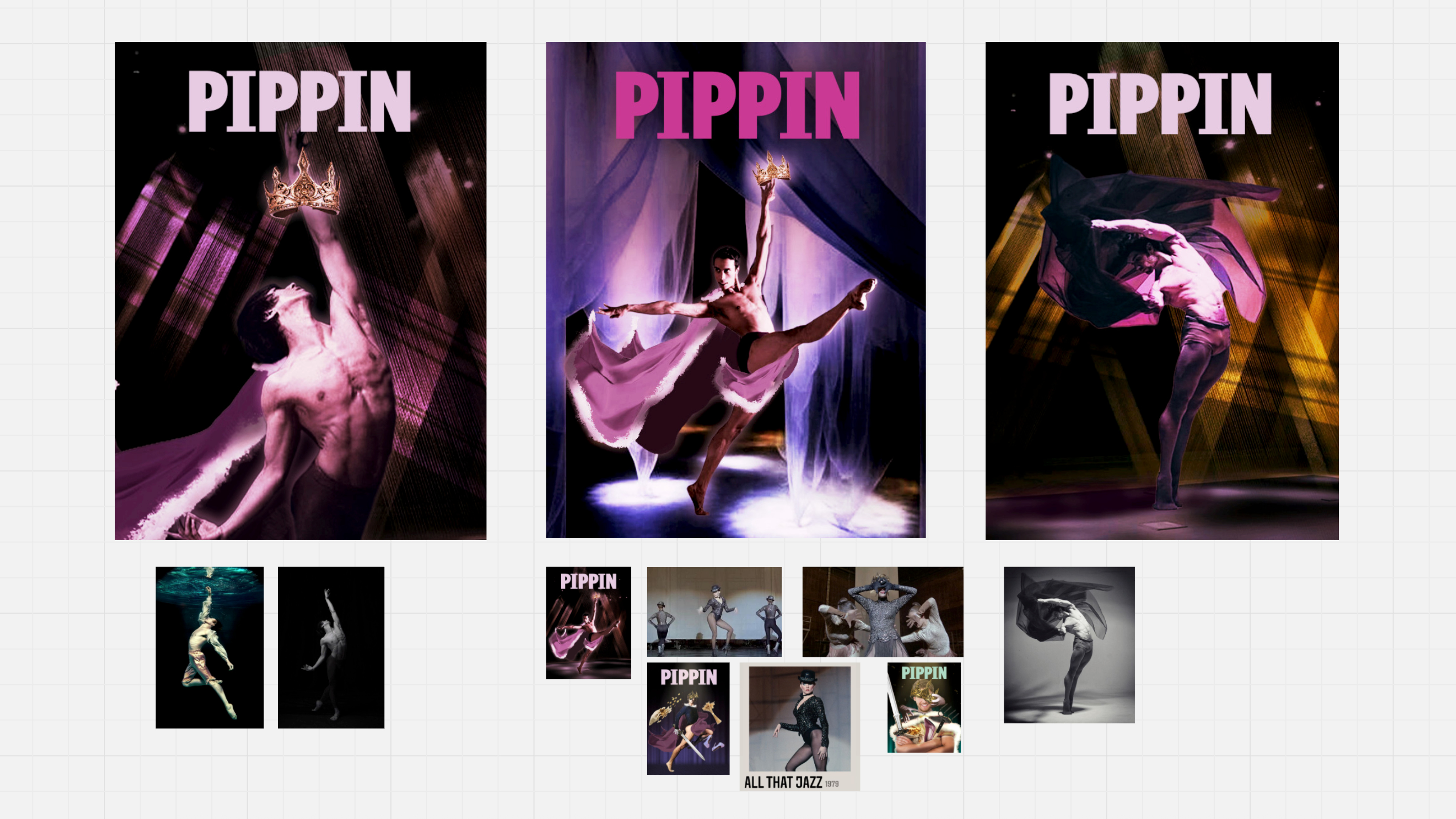
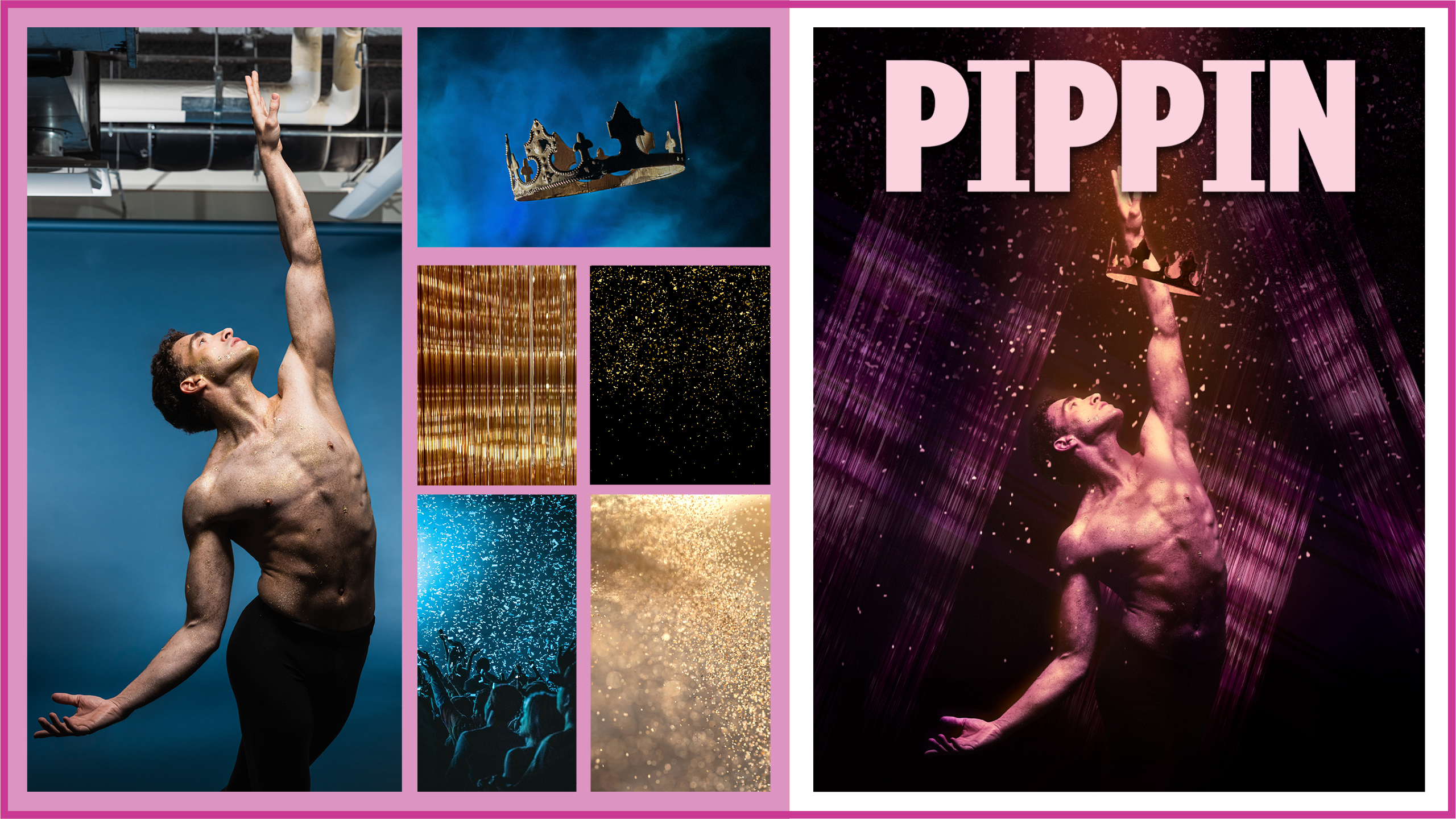
Pippin is a well-known classic from the 70s. Its art often leans into the "medieval traveling performers" aspect of the story-telling, so to distinguish ourselves from the other productions, our intention was to lean into the drama and grittiness without it looking like a circus.  The goal for this graphic was to find a way to depict "the journey of man," where the subject would be striving for something greater, while also conveying the sensual, dark, and cynical themes of the show.

With that in mind, we decided to keep Pippin as the subject of the graphic and have him reach up toward this light that is shining down on him, this depiction of a "promise of something greater," whatever he discovers that to be. The model wears little clothing as Pippin does in the show, and the glitter / sparkles that fall along with the light to illuminate his graceful pose also attach themselves to his body—almost as if he is being enveloped by this "greatness."
Show 7: What Became of Us
"A beautiful and moving play about two siblings striving for connection over the course of a lifetime. A sister and brother, the elder born in The Old Country and the younger born in This Country, share both big and small moments and memories from childhood through teenage rebellion, career successes, parenthood, and growing old. Their disparate perspectives lead to both fractures and forgiveness as they witness each other's stories." —SIGNATURE THEATRE

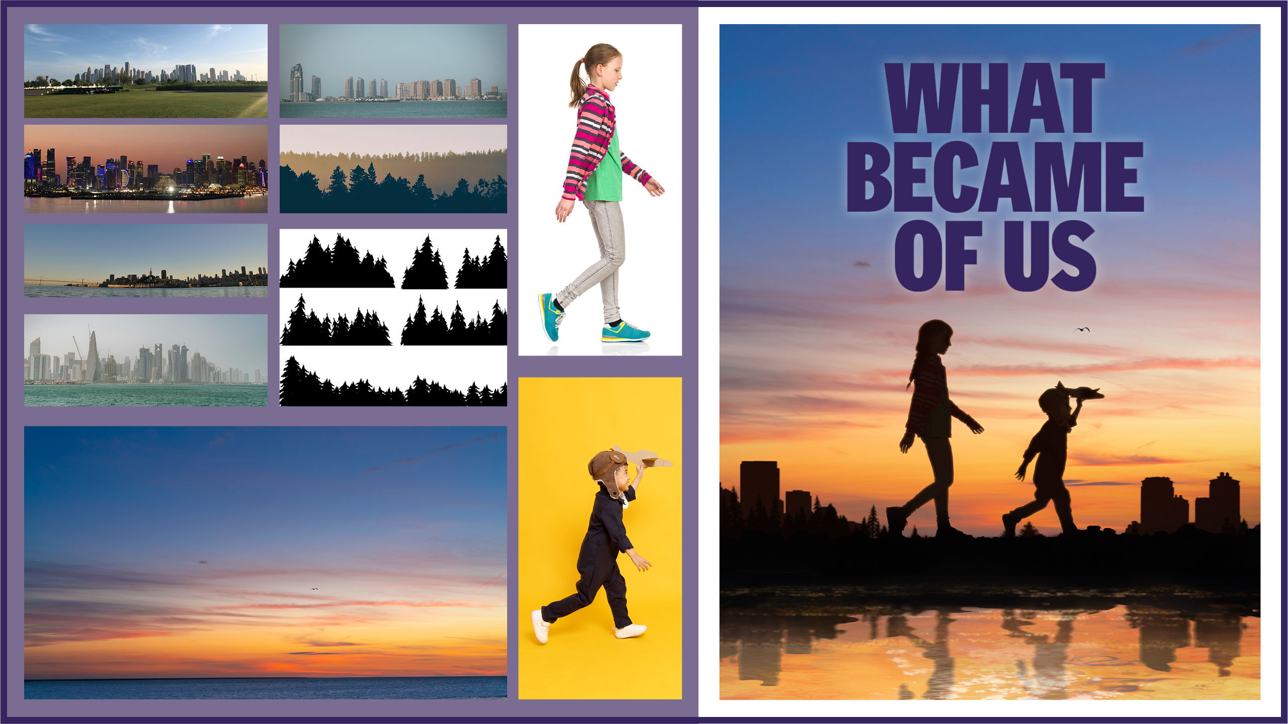
This was another show where we debated creating an abstract depiction. With a unique approach of having two different casts "played on alternating nights, each from a different diasporic background"—both of which have not been decided at this point—we couldn't give any hint to their ethnicity. However, details may change things, but the immigrant experience of moving and adapting to a new country is universal. How do we depict that universal experience of two siblings understanding their place in the new world and their relationship with each other?

Initial concepts either focused on silhouettes that were covered in some way such as collages or sheets (pillow forts, laundry), or focused on the lower half of the body or the legs so as not to give away ethnicity (jumping, hopscotch). Eventually we settled on a version of silhouettes in setting, or rising, sun depending on your interpretation. The older girl calmly walks behind her younger brother, who charges forward—depicting a glimpse into their relationship dynamic.  
Other projects